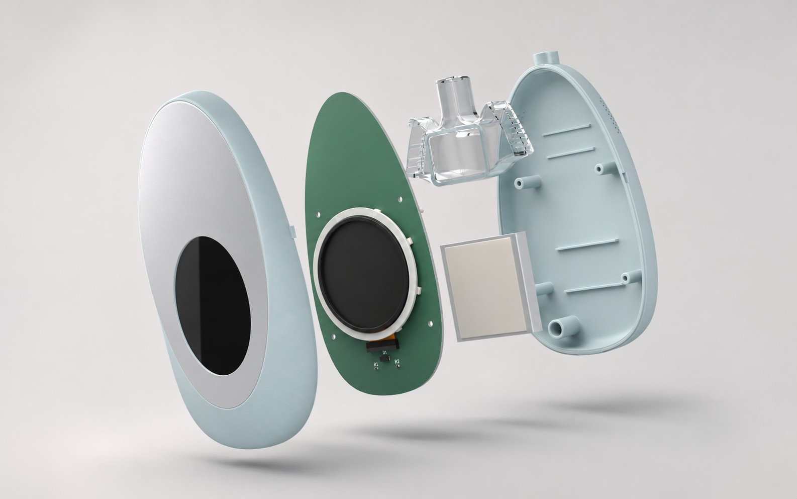
KAI
Voice-supported navigation for delivery riders
Role
Timeline
skills
Product Designer
2 weeks (2025)
UX Research · Interaction Design · VUI Design
KAI is a navigation concept combining voice guidance and simplified maps to reduce riders’ cognitive load while navigating and streamline food delivery.
are migrants, within or outside their state
average age, mostly young men
work part-time, under full-time hours
Delivery Workflow
Following the workflow revealed where riders had to keep checking, interpreting, switching apps and interacting with their phones.
Zomato
Google Maps
App switch
01 Navigate to pickup
02 Arrive at pickup
03 Navigate to the customer
04 Hand over
Zomato shows the restaurant pin and storefront photos. “Map” opens Google Maps.
Back in Zomato, the rider swipes “Reached pickup”. It only works near the pin.
Zomato shows the drop pin and the customer’s note. Google Maps ends at the pin, not the door.
Instructions and customer details appear. The rider swipes “Order delivered”.
On-Road Rider Behaviour
Primary and secondary research into rider behaviour, and the demands it puts on navigation.
01 / Repeated glances
02 / Poor map visibility
Checking the map to understand the next move.
Hard to read in sunlight, rain and low light, or from a low mount.
03 / Adapting to audio needs
04 / Repeated zoom adjustments
Riders juggle mounted phones, handheld use, and earbuds for navigation and calls.
Zooming in and out to inspect the route and due to uncertainty.
Key insights
City unfamiliarity
Visual distraction
Physical interaction
Many delivery riders are migrants. Riders new to a city may not yet have a mental map of its roads and landmarks.
Map clutter and poor screen visibility make it harder to pick out the information needed at a glance.
Tapping, zooming and switching between apps mean riders have to keep operating the phone while navigating.
Navigation uncertainty
Audio limitations
Work pressure
Riders need to interpret upcoming manoeuvres and confirm they are following the right route.
Some riders use one earbud or phone vibration to catch turn cues when spoken directions are difficult to hear.
Delivery targets and ratings create pressure to complete orders quickly.
Design direction
The research pointed to two areas to focus on: reducing the need to interact with the phone and making navigation easier to follow.
01 / Reduce manual interaction
02 / Simplify navigation information
Limit the need to tap, swipe, zoom and switch between apps while navigating. Use voice guidance to communicate key instructions when they’re needed.
Make the next manoeuvre easier to identify by prioritising relevant route information, useful landmarks and a clearer map.
Exploring ways to navigate
Why phone + voice?
Evaluation Criteria
Cost Safety Ease of use
Phone + Audio
Phone + wearable (haptics)
Audio + wearable (haptics)
Voice guidance reduces screen checks, but riders still need the map to identify the right road at complex junctions.
Audio(existing) + phone
Phone + Add on to Phone + Audio
Designing KAI’s voice
VUI Persona
Voice Design Decisions
Delivery riders work under constant time pressure. KAI provides calm, concise guidance without rushing, judging, or overwhelming them.
Four rules for when and how KAI speaks.
01
02
CONCISE
DETAILED
Speak only when it matters
Reroute without pressure
Give timely directions. Stay silent when no instruction is needed.
Avoid repeated corrections when riders take a different route.
NEUTRAL
CALM
LANDMARK-LED
ROAD-LED
03
04
Warmer when stressed
Let riders control guidance
CONTINUOUS
CONTEXT AWARE
Use short, companion-like phrases in stressful situations.
Allow riders to mute guidance when they know the route.
KAI
Google Maps
VUI Interaction Flow
Rider
KAI speaks
KAI silent
KAI checks
How KAI responds when the rider leaves the route, asks for quiet, or hits a roadblock.
Recalculates without repeated prompts
Yes
Gives one useful direction
Never “You missed your turn”.
Route Deviation
Rider leaves the route
Keeps own way?
“Take the next left.
02 / REROUTE WITHOUT PRESSURE
Back on route
No
Speaks only for
Quiet mode
Confirms once
Says mute while KAI speaks
Stays quiet until pickup or guidance is resumed by the rider (“hello Kai”)
Blocked road · pickup side · arrival
04 / LET RIDERS CONTROL GUIDANCE
“Okay, quiet.”
Continues on new route. KAI stays silent.
Yes
Problem and fix, in one line
Road blocked ahead
Rider encounters a roadblock
Takes the left?
“Road blocked ahead. Let’s take the next left.”
03 / WARMER WHEN STRESSED
KAI recalculates silently.
No
Designing the map
Wireframes
Five steps from Google Maps as riders use it today to the KAI screen. Each step removes or moves one thing.
Google Maps today - Baseline
Fewer labels - Less clutter
Icons back on right - Familiarity
ETA reduced - KAI voice layer
Left side icons - Thumb reach
Final UI
The riding screen in day and night modes, and mounted on the bike. The labels mark the eight design decisions.
01 / One-Tap Zomato Access
Returns riders to their active order quickly.
03 / Fewer Map Labels
02 / High-Contrast Cyan Route
Less clutter keeps attention on the route.
Stands out against the dark map at night.
05 / Purple Listening Cue
04 / Destination Over ETA
Distinguishes KAI’s listening state from the cyan route.
Keeps the delivery task in focus.
06 / Landmark-Led Directions
Familiar landmarks help riders recognise upcoming turns.
08 / Two Controls, Not Five
07 / Familiar Control Positions
Only volume and route preview stay on the map.
Consistent placement avoids disrupting learned habits.
Context-aware map zoom
The map adjusts its zoom based on the rider’s situation, showing the wider route when they need an overview and bringing the next turn into view when they’re on long stretches of road.
Before the ride — Route overview
During the ride — Upcoming turn
The map starts zoomed out so riders can see the route and build the mental model of the map. Once movement is detected, it zooms in for closer navigation.
On long, straight roads, the map zooms out to bring the next turn into view, helping riders anticipate where the route changes without manually adjusting the map.
What I learned
Riders’ workarounds can point to simple design changes that make a big difference.
The right design choice depends on the situation. What works in one context may not work in another.
01
02
Making something easier to use doesn’t always mean making it easier to interact with. Sometimes, the goal is to reduce the need to use the phone.
Good design considers what the user is dealing with in the moment, not just the task they need to complete.
03
04